
The Problem with the iPhone 6 and 6 Plus that Nobody is Talking About
/
The iPhone 6 and 6 Plus have done a much better job of capturing a broader audience for Apple than previous iPhones. The 6 and 6 Plus together drove a massive increase in Q1 revenue for Apple: 33% over the same time last year.
But these phones are not iPhones so much as they are phones that runs iOS.
Apple's core strength is its tight integration between software and hardware. It allows the company to create simple and reliable products with margins the rest of us can only dream of.
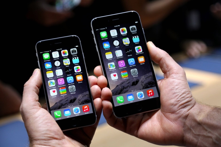
iOS was designed for the iPhone 1. It had a small, 3.5 inch screen. All of iOS's UI was designed with the assumption that the user could reach any part of the screen with the hand that was also holding the phone. As long as iOS runs on an iPhone the entire interface is easily accessible with one hand.
But Apple was feeling pressure from Samsung and other Android device makers. Between Q2 of 2011 and Q2 of 2014 iOS dropped from an 18.8% market share to only 11.7%. Something had to change. So Apple invested significant resources into designing a device with a larger screen.

The risk appears to have paid off. The iPhone 6 and 6 Plus have exceeded sales expectations and were a major contributor to Apple's recent "most profitable quarter for any company ever" achievement.
But it came at the cost of easy one-handed operation.
Apple's design team realizes this is a problem; they added two new features to fix it. First is a nifty gesture to navigate back. Just swipe from the left edge of the screen toward the center. Apple even added those "revolutionary seamless corners" on the iPhone 6 specifically to facilitate this gesture. The second feature is called "reachability". you can lightly double-tap the home button to pull the UI half way down the screen. This allows you to then reach the top half of the screen when you're using the phone one handed.
What do these solutions both have in common? They are both hidden features with no visible UI relegating them both to the realm of power users.
Obviously a 5.5" screen will never be 100% usable with one hand. But are these two gestures really the most reasonable compromise that the best designers on earth have to offer? Why the sudden shift in priorities? Is this a sign of how Apple will function in a post-Jobs era?
Apple has changed the hardware for the better, now it's time to change the software that's designed to run on it.